A Co-created Visual Identity
Festivals have always been about celebration and community, which are both elusive in 2020.
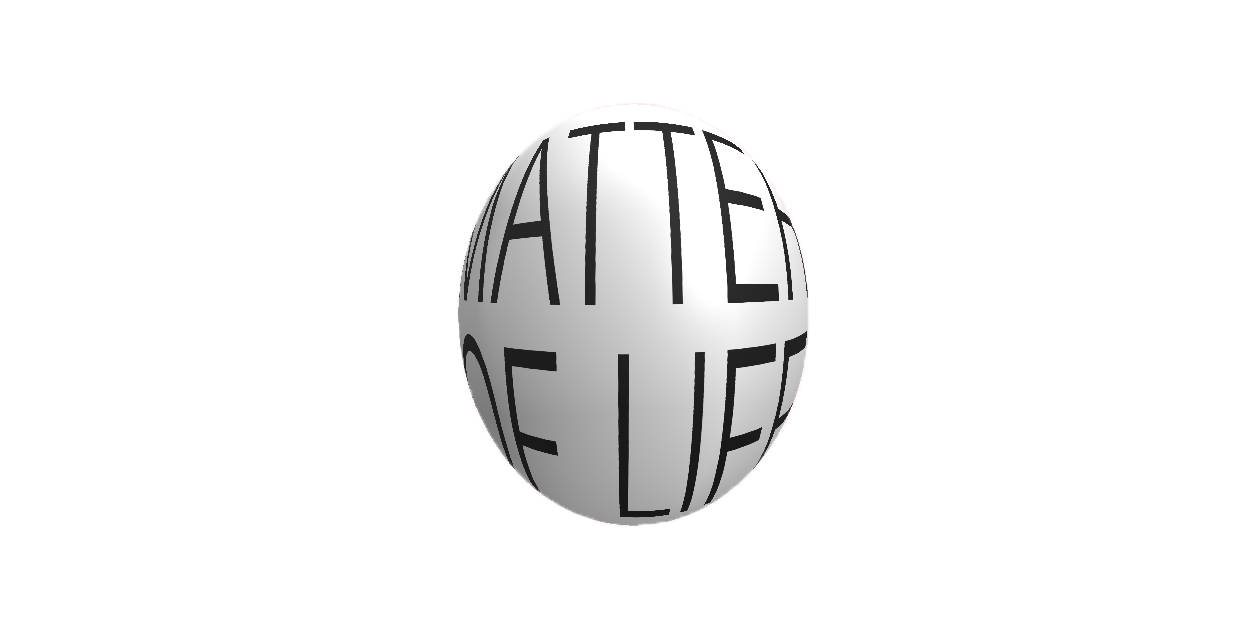
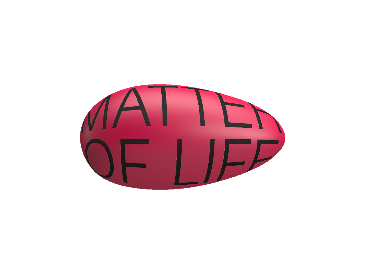
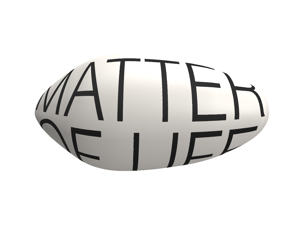
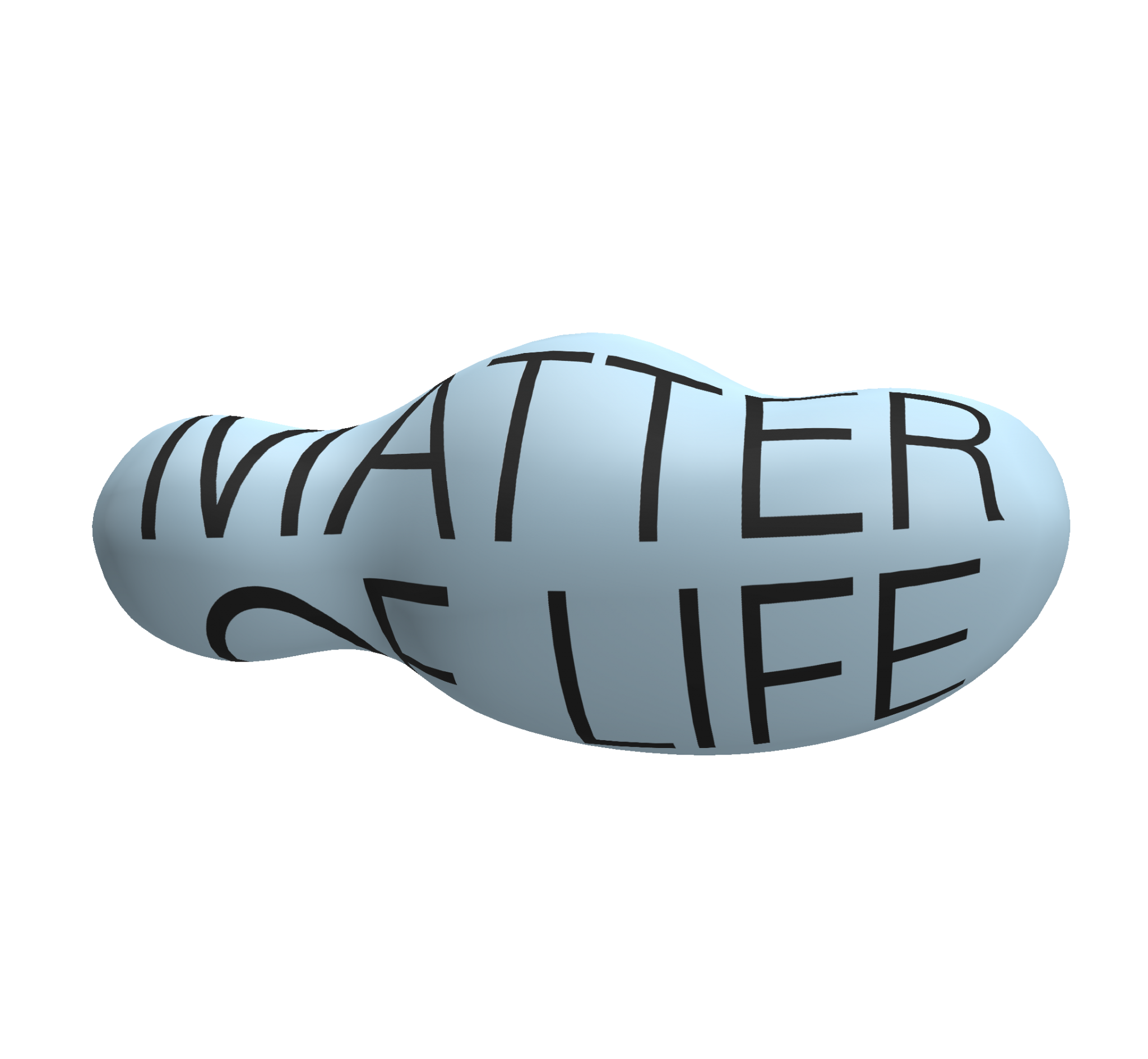
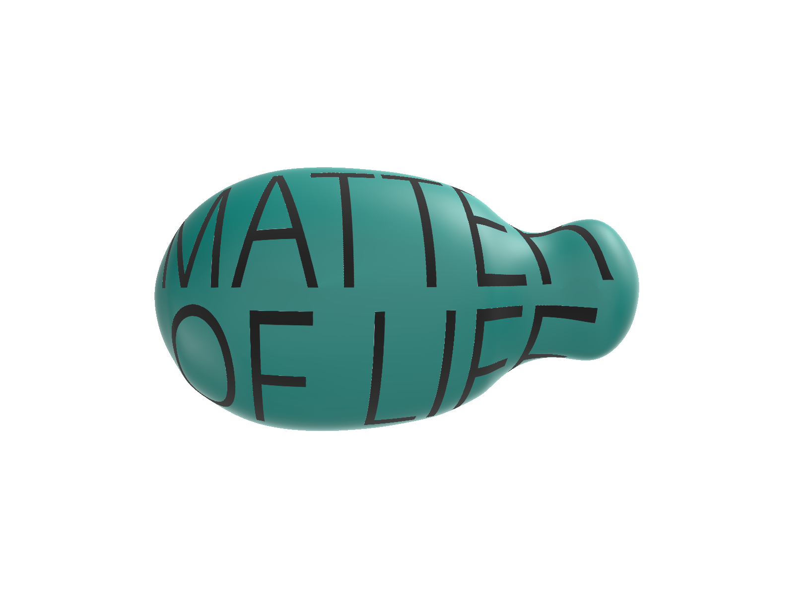
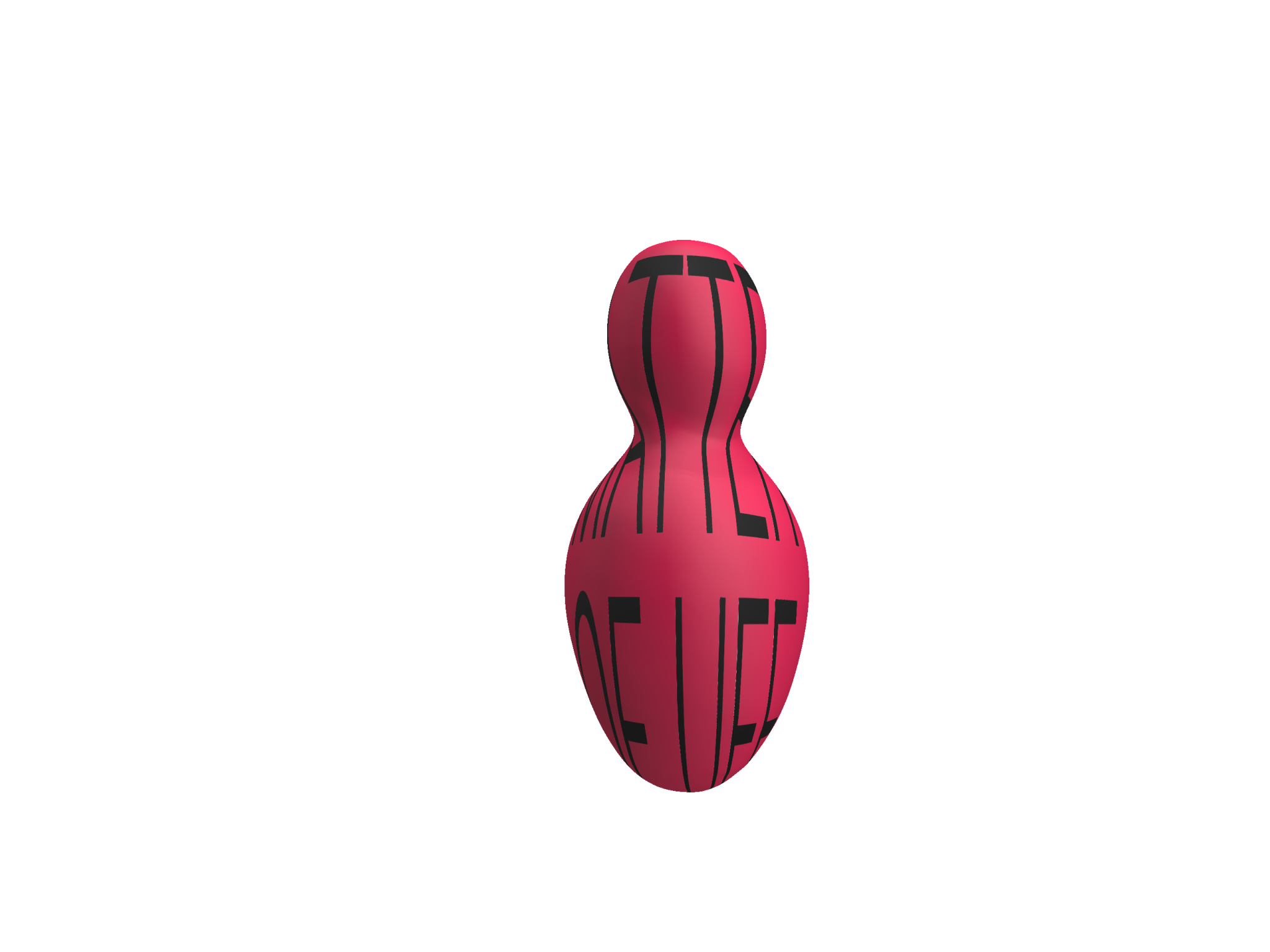
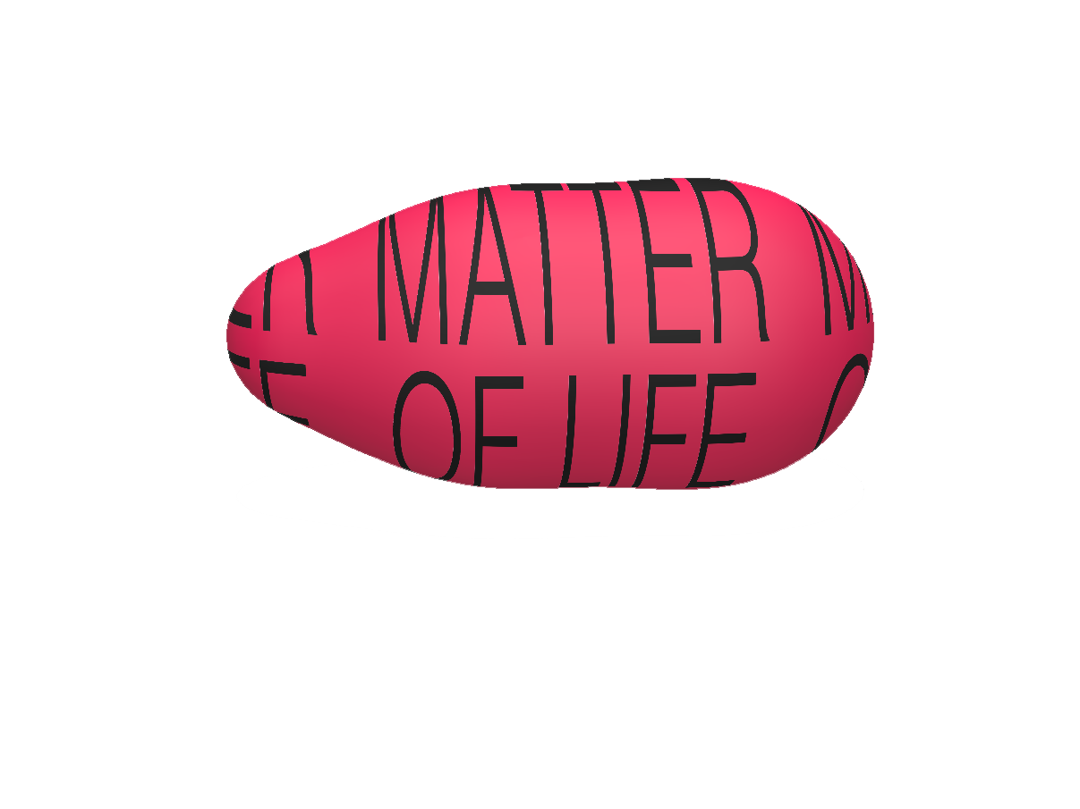
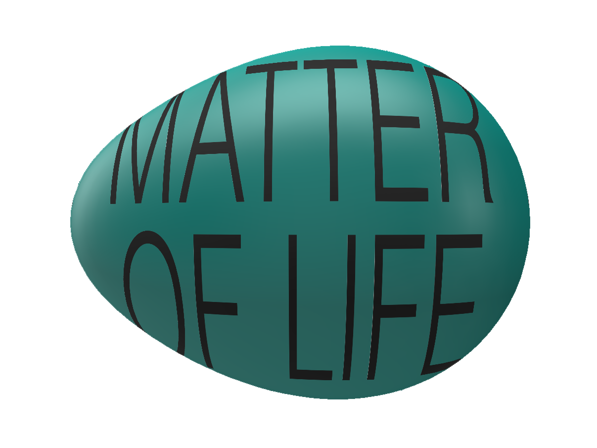
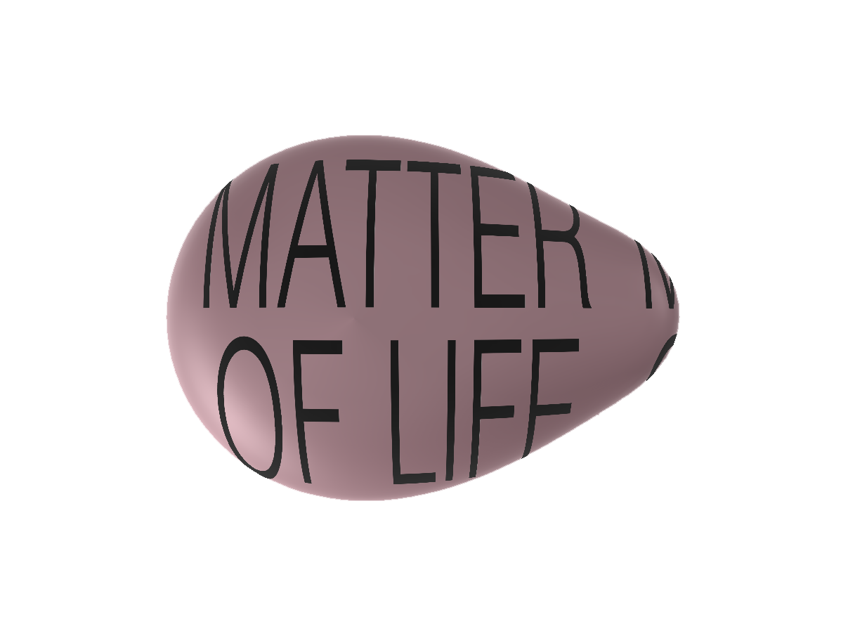
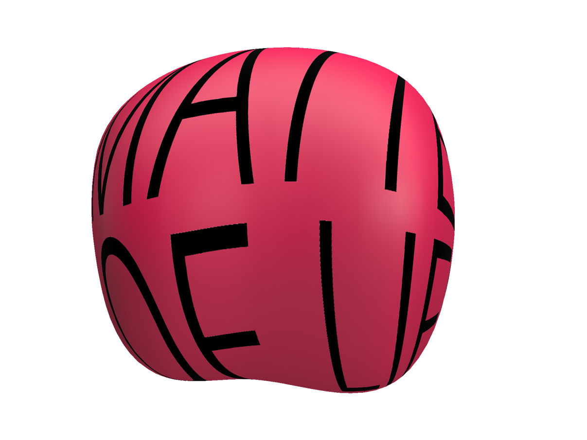
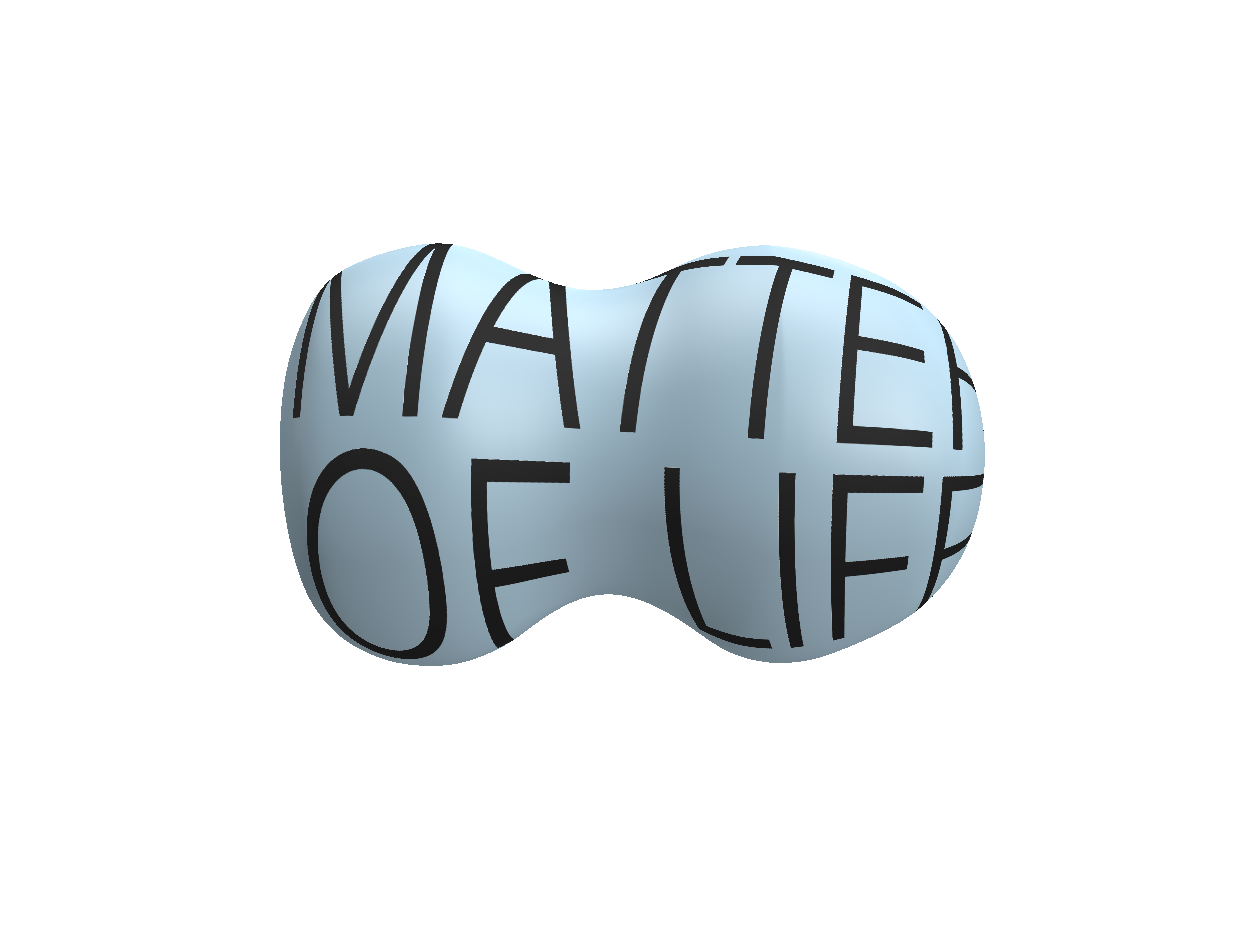
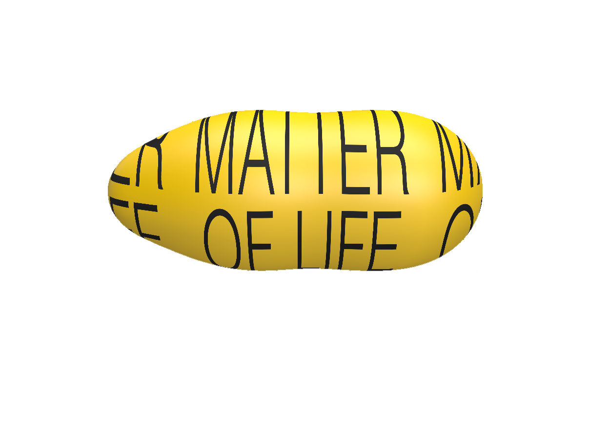
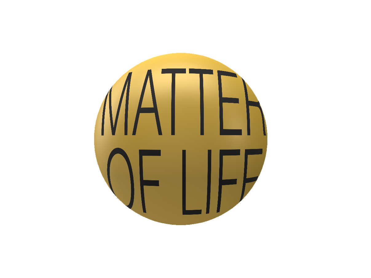
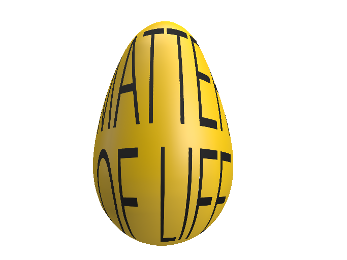
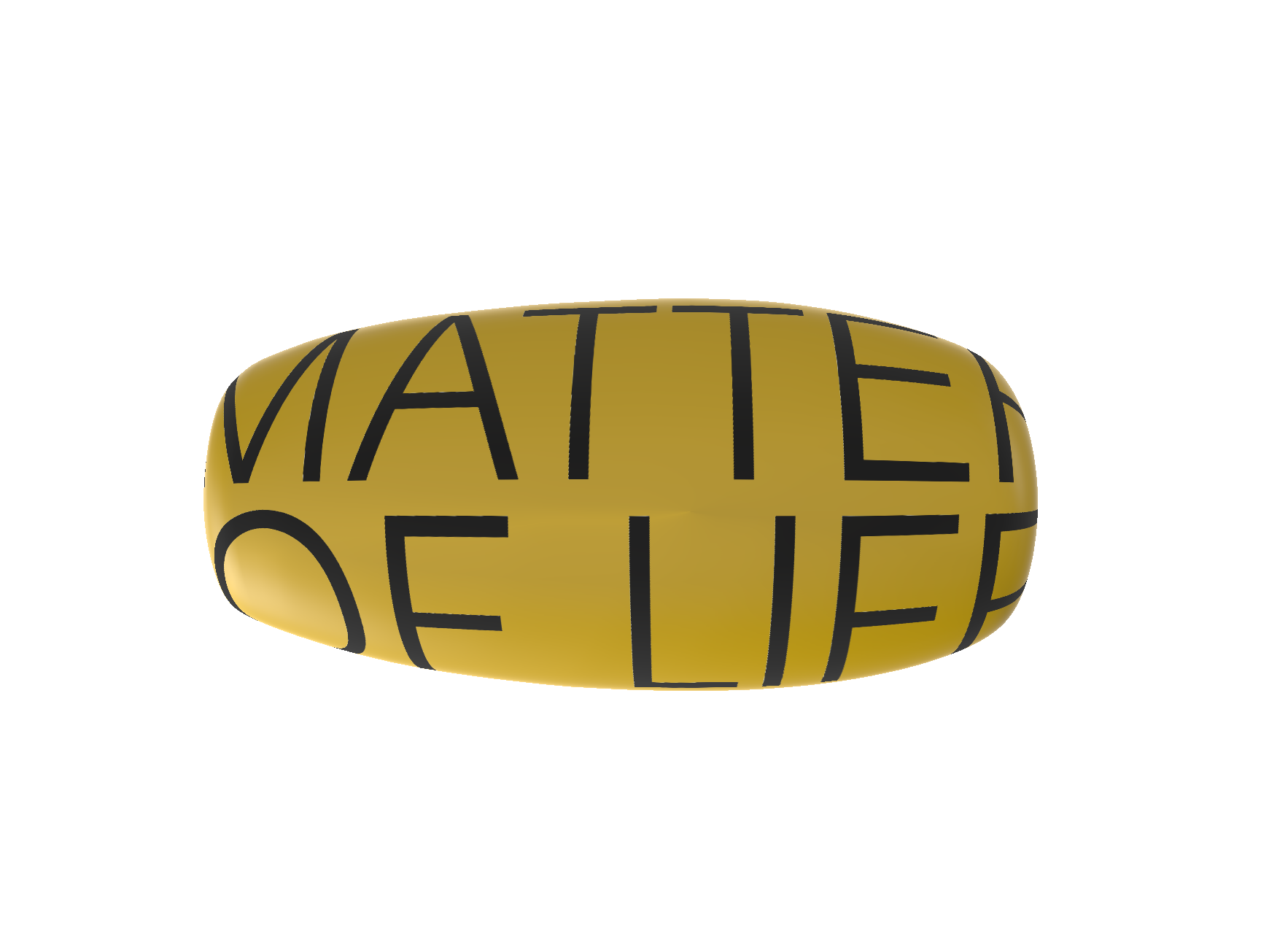
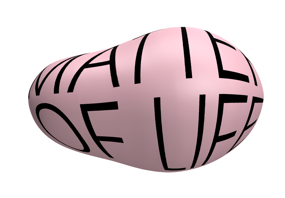
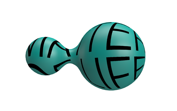
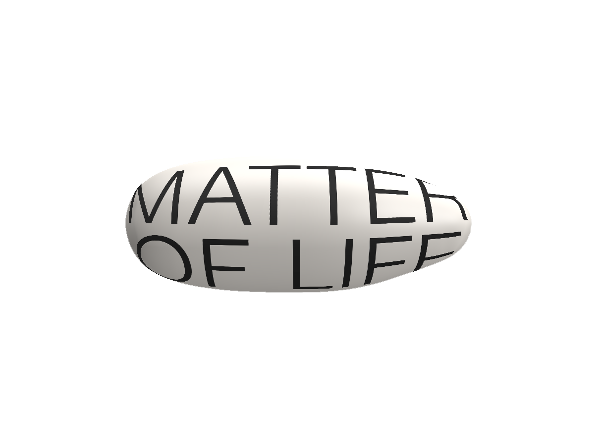
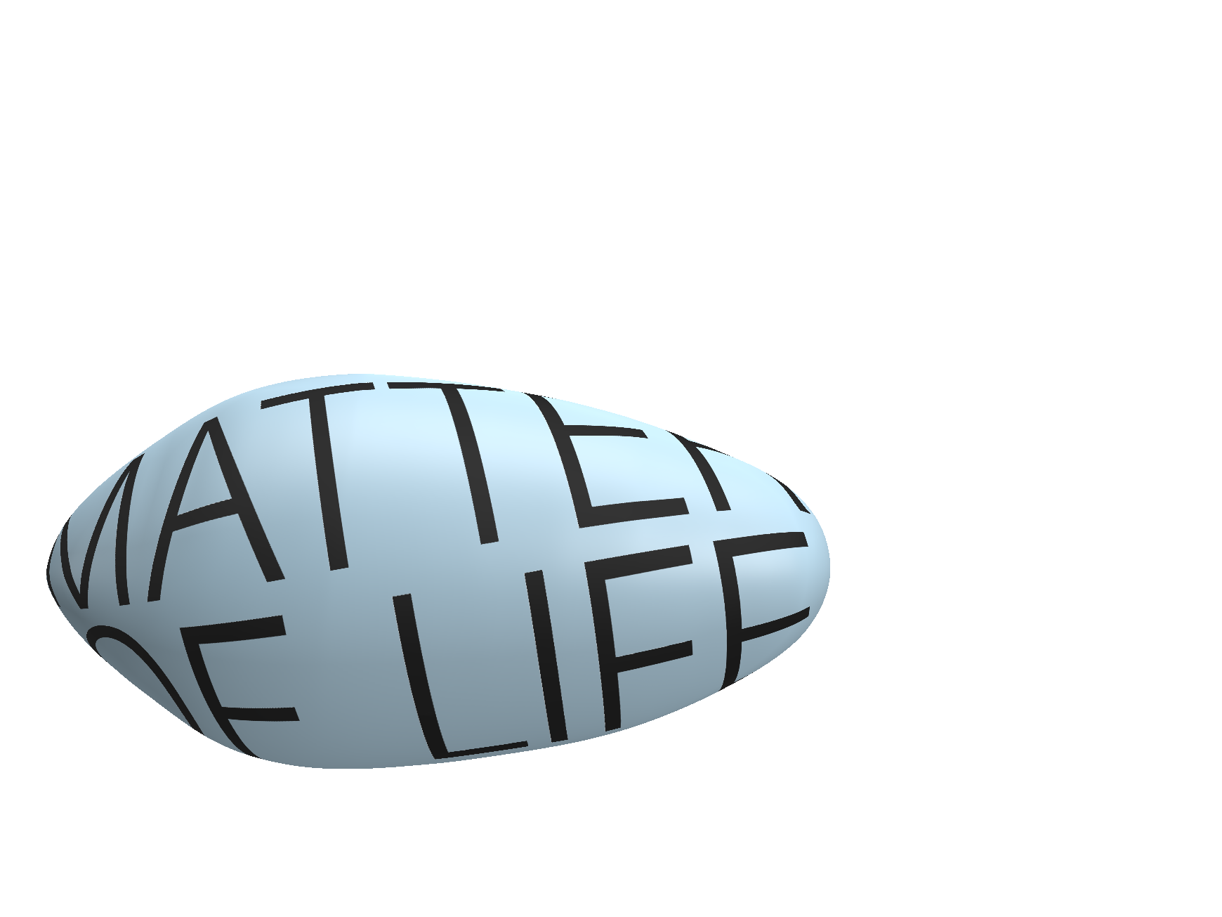
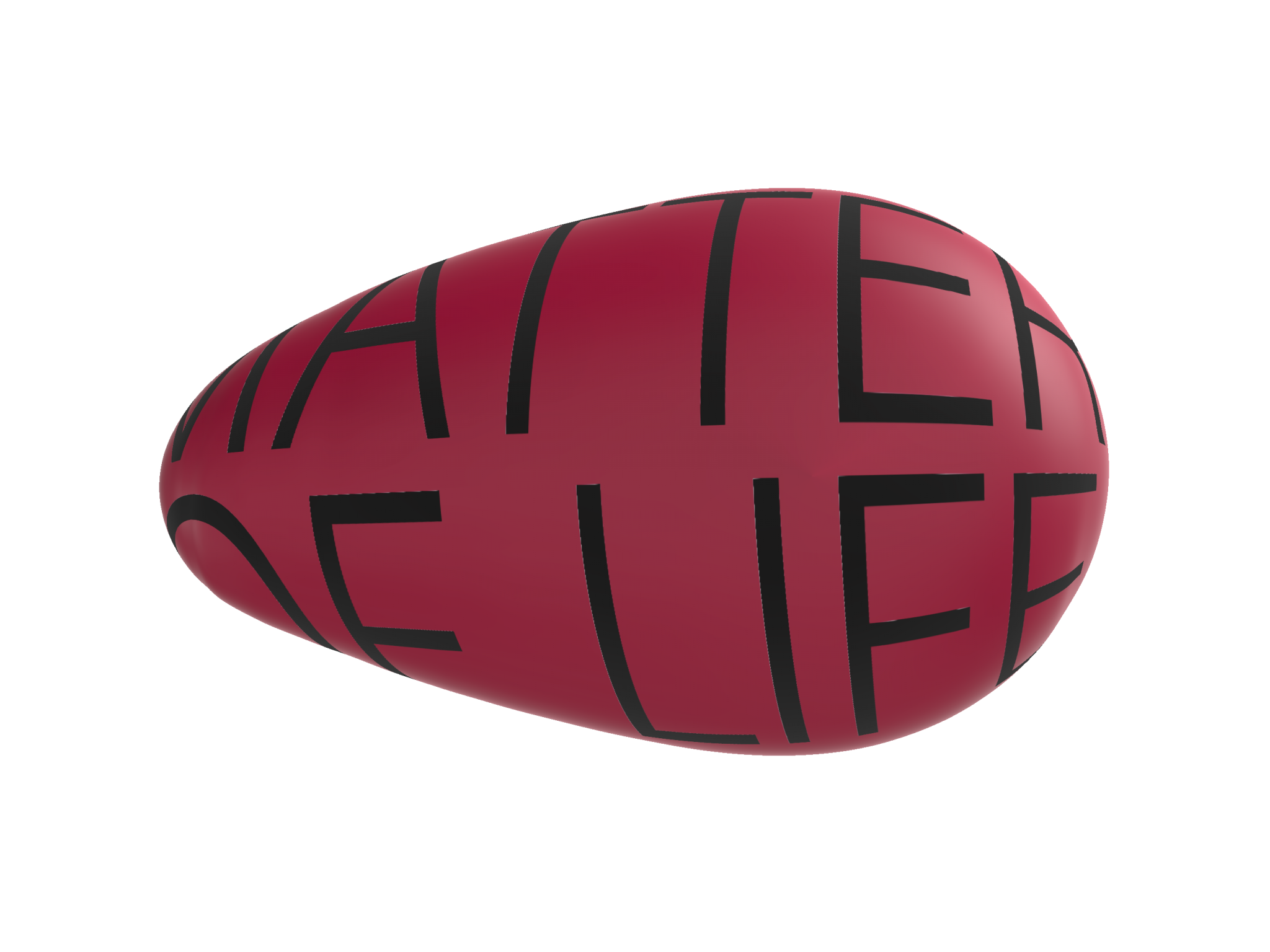
The concept of this year’s deTour visual identity stems from “qi collection” (集氣), an act used by the protagonist of the renowned Japanese manga Dragon Ball to gather massive energy to defeat the villains. The concept has been popularised and represents solidarity and courage in Asian pop culture.
The concept of “qi” is rooted in Eastern philosophy, signifying “air” and “life force”. We find it a fitting reference for the event’s annual theme “Matter of Life”, as we all share the air we breathe. It is air that unites all mankind—a poignant reminder for our new mask-wearing reality.
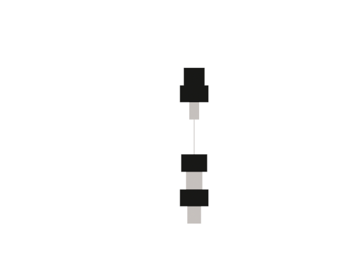
Festivals are never solitary events. This year, we envision a visual identity, created collaboratively by the co-creators, as a small gesture of unity and goodwill in an uncertain world. All the unique shapes below were generated by the sound wave of each co-creator’s voice message, forming the visual identity with different combinations.

Shin Wong
Curator-at-large
Trilingua Design
Curatorial Team
Hato
Key Visual Design

WEEWUNGWUNG
Website Design & Development
Architecture Commons
Exhibition Design

Whatever Inc.
Co-creator

CoLAB
Co-creator

NOSIGNER
Co-creator

Synoptic Office
Co-creator

New Office Works
Co-creator

Arnold Wong, Keith Chan, Stephen Ip
Co-creator

Common Ground Design
Co-creator
Wilf Cho
Co-creator

Riyo Chan, Obie Chan
Co-creator

Orient Occident Atelier | OOA
Co-creator

h0nh1m (Chris Cheung)
Co-creator

WHITEGROUND
Co-creator

aona & Cou Tou Wood Working
Co-creator

WARE
Co-creator